Yesterday, a friend posted this chart to Facebook, noting that the topic was “uk ph.d. graduate career paths” and that in their experience (as an academic in North America), the percentages looked pretty close. I share my friend’s concern about career options for PhDs, but looking at the diagram, the thing that stands out to me is how terrible it is — as a chart.
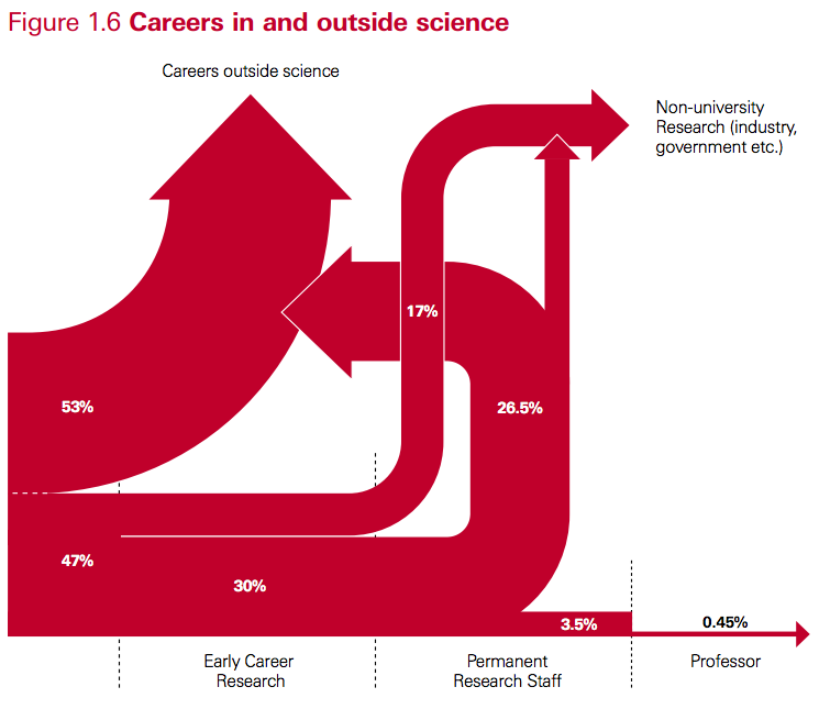
Its source is a 2010 Royal Society policy report (PDF) entitled “The Scientific Century: securing our future prosperity”. In the original, Fig. 1.6 has a caption:
This diagram illustrates the transition points in typical academic scientific careers following a PhD and shows the flow of scientifically-trained people into other sectors. It is a simplified snapshot based on recent data from HEFCE[33], the Research Base Funders Forum[34] and from the Higher Education Statistics Agency’s (HESA) Annual Destinations of Leavers from Higher Education’ (DLHE) survey. It also draws on Vitae’s analysis of the DLHE survey[35]. It does not show career breaks or moves back into academic science from other sectors.
So what’s so bad about the chart? Some obvious issues:
- It is unclear what goes in on the left and to a lesser degree what is covered by the end points. The report indicates in a footnote that the term “science” is used “as shorthand for disciplines in the natural sciences, technology, engineering and mathematics,” but the three documents used for input categorise the fields in different ways, and there is no indication which fields exactly would have been selected.
- Line thickness is not proportional to percentage weight. The 26.5% and 30% streams have the same thickness, and the 17% stream is much less than half the thickness of either. The 3.5% stream is more than half the thickness of the 17% stream.
- Why does “Permanent Research Staff” not end in an arrow? And why does the arrow from “Permanent Research Staff” to “Careers Outside Science” bend backwards (to suggest it is a step back in one’s career, that is, an implicit value judgement?) and then not even merge with the output stream?
- Does it really mean to suggest that no one goes from “Early Career Research” (that is, a post-doc) to “Career Outside Science” (or to industry research)? In my experience, watching post-docs, that is quite a common choice for post-docs precisely because non-academic jobs may be offering better pay and conditions, or because they don’t have a choice at that stage.
A graph like this is called a Sankey Diagram. They are very common to illustrate flows of energy, or of any quantity that is overall conserved (like here, the cohort of PhD. I wondered if I could make a better one (except for the flaws in content itself), even though I’ve never made one. I like to use R for data visualization tasks (or Python of course), so I quickly found out about a) Ramnath Vaidyanathan’s rather intriguing rCharts library, which provides interfaces from R to a variety of JavaScript plotting libraries and b) the implementation of the Sankey plugin for d3.js by someone called timelyportfolio. The integration is still a little rough for the newbie, but some crucial remarks at the end of someone else’s tutorial got me started. (I’ve long been wanting to play with d3.js anyway, as it has impressive capabilities for geographic visualizations.)
Here’s my version:
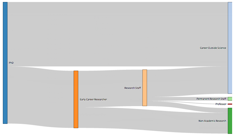
Well, the fonts are too small. Click for full-sized image.
One advantage of plotting directly to HTML5/JavaScript is that sharing charts is extremely easy. As produced by d3.js, the chart isn’t too impressive, with several links overlapping. But as it is interactive, I manually cleaned it up and took the above screenshot.[1]
The cleaner chart illustrates most of the issues with the original one. Clearly it is unrealistic that any post-doc who later ends up in a career outside science or in non-academic research goes through another academic research staff position first. (And some go from post-doc directly to professor.) A bigger problem is the absence of differentiation by discipline. What does it mean that maybe 25% of STEM PhDs go through a period as temporary academic researchers before ending up outside science? I completely agree that this part of a researcher’s career is currently highly problematic in most Western countries (keywords: low compensation, high job insecurity, high expectations of personal investment in research), but there is a huge difference between a graduate from many engineering disciplines, where highly qualified people are finding highly satisfying “outside science” jobs, and fields where not staying in academia or public research after a PhD is the equivalent of a career change (think of astrophysics or pure mathematics). Also, the longer I think about it and look at some of the source documents (Vitae report, PDF) the more questions come up. Does Medicine count? Is teaching part of “career outside science”? What about higher education lectureships?
So in the end I remain with the feeling that no graph would have been more useful than this graph. The only thing it illustrates is confusion and uncertainty in the career paths, and as such, wouldn’t using a work of art to make the point have been more honest than what I can only call the illusion of science?
[1] For anyone interested, the code is here. It was also an opportunity to try out graphs in R.
