A thought on serial ports

Some time during the last year or two there has been a change in my attitude towards serial connections: I used to think of them as a relic of a bygone time, when personal computers came with RS232/DE-9 interfaces and you could find them on all sorts of peripherals.  A relic used by scientists and instrument makers for reasons, probably, of expedience. And if your instrument comes with a serial connector, you sigh, go look for a serial-to-USB converter and hope that it’s not one with an unmaintained and buggy driver that for all time will make you doubt in your data.

It is true that my deep negativity stemmed from the time I was receiving GPS signals in an airplane and worried a lot about USB buffer lag impacting the time stamps. I still think my worries were founded in this particular application. It is also true that for full-blown precision instruments providing an ethernet interface (or maybe something else?) out oft he box would be highly preferable to the unholy rat’s nest of serial hubs, USB converters and ethernet hubs (not to mention proprietary software to run them) that you find in too many scientific installations. 

But since I’ve been playing with electronics and development boards, dealing with UART feels completely normal and appropriate. I own a bunch of converters (USB-to-UART, USB-to-DE-9) with FTDI chips, which work very well. And while it’s true that I’m far from understanding everything about serial communications, and am still leery of the reliability of timings below the ms level, it’s a lot more convenient and manageable than other options. 

To be continued… 

Plotting polygon Shapefiles on a Matplotlib Basemap with GeoPandas, Shapely and Descartes

I often use Python to plot data on a map and like to use the Matplotlib Basemap Toolkit. In practice, I use a lot of different libraries to access various data formats (raster, vector, serialized…), select and analyse them, generate, save and visualize outputs, and it’s not always obvious to string one’s favourite tools together into efficient processing chains.

For example,  I’ve also become fond of Pandas DataFrames, which offer a great interface to statistical analysis (e.g. the statsmodels module), and its geo-enabled version, GeoPandas. Both Basemap and GeoPandas can deal with the popular (alas!) ESRI Shapefile format, which is what many many (vector) GIS datasets are published in. But they aren’t made for working together. This post is about how I currently go about processing Shapefile data with GeoPandas first and then plotting it on a map using Basemap. I’m using an extremely simple example: a polygon Shapefile of the earth’s glaciated areas from the handy, and free,  NaturalEarth Data site. The data is already in geographic coordinates (latitudes/longitudes), with a WGS 84 datum. We therefore don’t have to worry about preprocessing the input with suitable coordinate transforms. (Often, you do have to think about this sort of thing before you get going…). All my code is available in an IPython (or Jupyther) Notebook, which should work with both Python 2 and 3.

So let’s say we have our glacier data in a file called ne_10m_glaciated_areas.shp. GeoPandas can read this file directly:

import geopandas as gp
glaciers = gp.GeoDataFrame.from_file(
    'ne_10m_glaciated_areas/ne_10m_glaciated_areas.shp')
glaciers.head()

The output looks something like this:

Screen Shot 2016-03-06 at 17.02.23

The geometry column (a GeoSeries) contains Shapely geometries, which is very convenient for further processing. These are either of type Polygon, or MultiPolygon for glaciers with multiple disjoint parts. GeoPandas GeoDataFrames or GeoSeries can be visualized extremely easily. However, for large global datasets, the result may be disappointing:

glaciers.plot()

allglaciers

If we want to focus on a small area of the earth, we have a number of options: we can use Matplotlib to set the x- and y-limits of the plot. Or we can filter the dataset geographically, and only, say, plot those glaciers that intersect a rectangular area in the vicinity of Juneau, AK, that is, the Alaskan Panhandle and the adjacent Western British Columbia. Filtering the dataset first also speeds up plotting, by a lot:

import shapely
studyarea = shapely.geometry.box(-136., 56., -130., 60.)
ax1 = glaciers[glaciers.geometry.intersects(studyarea)].plot()
ax1.set_aspect(2)
fig = plt.gcf()
fig.set_size_inches(10, 10)

glaciersselect

This is remarkable for so few lines of code, but it’s also as far as as we can get with GeoPandas alone. For more sophisticated maps, enter Basemap. The Basemap module offers two major tools:

  • a Basemap class that represents a map in a pretty good selection of coordinate systems and is able to transform arbitrary (longitude, latitude) coordinate pairs into the map’s coordinates
  • a rich database of country and state borders, water bodies, coast lines, all in multiple spatial resolutions

Features that add on to these include plotting parallels and meridians, scale bars, and reading Shapefiles. But we don’t want to use Basemap to read our Shapefile — we want to plot the selections we’ve already made from the Shapefile on top of it.

The basic syntax is to instantiate a Basemap with whatever options one finds suitable:

mm = Basemap(projection=..., width=..., height=...)

… and then to add whatever other features we want. To transform a (longitude, latitude) coordinate pair, we use mm(lon, lat). The resulting transformed coordinates can then be plotted on the map the usual Matplotlib way, for example via mm.scatter(x, y, size, ...). The code to plot our study area and the city of Juneau, in the Albers Equal Area conical projection (good for high- and low-latitude regions), at intermediate resolution, and including water, ocean, coastlines, country borders etc. is:

from mpl_toolkits.basemap import Basemap
import numpy as np
water = 'lightskyblue'
earth = 'cornsilk'
juneau_lon, juneau_lat = -134.4167, 58.3

fig, ax1 = plt.subplots(figsize=(12, 10))
mm = Basemap(
    width=600000, height=400000,
    resolution='i',
    projection='aea',
    ellps='WGS84',
    lat_1=55., lat_2=65.,
    lat_0=58., lon_0=-134)
coast = mm.drawcoastlines()
rivers = mm.drawrivers(color=water, linewidth=1.5)
continents = mm.fillcontinents(
    color=earth,
    lake_color=water)
bound= mm.drawmapboundary(fill_color=water)
countries = mm.drawcountries()
merid = mm.drawmeridians(
    np.arange(-180, 180, 2), 
    labels=[False, False, False, True])
parall = mm.drawparallels(
    np.arange(0, 80), 
    labels=[True, True, False, False])
x, y = mm(juneau_lon, juneau_lat)
juneau = mm.scatter(x, y, 80, 
    label="Juneau", color='red', zorder=10)

juneaumap

This result may even be quite suitable for publication-quality maps. To add our polygons, we need two more ingredients:

  • shapely.ops.transform is a function that applies a coordinate transformation (that is, a function that operates on coordinate pairs) to whole Shapely geometries
  • The Descartes library provides a PolygonPatch object suitable to be added to a Matplotlib plot

To put it together, we need to take into account the difference between Polygon and MultiPolygon types:

patches = []
selection = glaciers[glaciers.geometry.intersects(studyarea)]
for poly in selection.geometry:
    if poly.geom_type == 'Polygon':
        mpoly = shapely.ops.transform(mm, poly)
        patches.append(PolygonPatch(mpoly))
    elif poly.geom_type == 'MultiPolygon':
        for subpoly in poly:
            mpoly = shapely.ops.transform(mm, poly)
            patches.append(PolygonPatch(mpoly))
    else:
        print(poly, "is neither a polygon nor a multi-polygon. Skipping it.")
glaciers = ax1.add_collection(
    PatchCollection(patches, match_original=True))

The final result, now in high resolution, looks like this:

glaciersmap
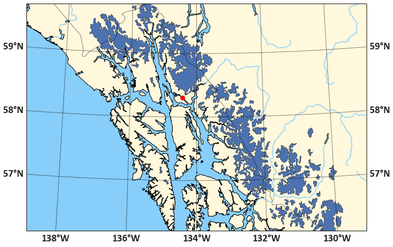
We could do a lot more — add labels, plot glaciers in different colors, for example. Feel free to play with the code.

Tip: Earth View from Google

As a Google Chrome user (alternating  with Firefox depending on usage scenario: I’m a multi-browser person) and satellite imagery person, I’ve been enjoying a browser plug-in called Earth View, which customises every new tab with an image out of Google’s collection of particularly spectacular satellite imagery. These images are drawn from the DigitalGlobe and Astrium/CNES imagery that Google acquired for use in Google Earth and Google Maps.  DigitalGlobes launched and runs the IKONOS, GeoEye and WorldView series of commercial satellites, and Astrium (or their parent company) operates the SPOT and Pleïades and other satellite platforms for the French and European space agencies. This is high-resolution optical imagery on a scale of 50 cm to 2.5m.

But even if you don’t use Chrome, you can still enjoy the images! Google recently launched an improved web site where you can browse, gallery-style, and share images with a direct link or on some social media platforms. There is also one-click access to the location on Google Maps and the option to download. Obviously, you just get a processed RGB JPEG  at less than full resolution (and not a geo-referenced multi-band reflectance dataset which is available from the original sources for purchase), but still, the images are a lovely option to explore landscapes and urban structure. I’m learning a lot about serendipitous places of the world. Here’s an agriculture in Vietnam, for example. Click on the map and zoom in for a view of houses and roads along canals:

Screen Shot 2015-12-01 at 21.27.40.png

Or click on the hidden arrow to the right to find other places, such as in the US, Egypt, or Spain.

A scientist goes to PyCon 2015

It’s already been two months, and I still haven’t posted about going to PyCon in Montreal. I had a wonderful experience! Many thanks to the PSF and PyLadies, whose travel grant brought the cost down into the realm of the feasible for me.

PyCon is an extremely well-run conference, run by a community that emphasizes a welcoming attitude. There’s a visible science presence (much more general than the topics you’d see at SciPy, of course), and an impressive 30% of speakers were women. I came away from it with many new ideas, got to talk with countless Python people, met many members of the geospatial community, including Sean Gillies, the author of such useful libraries as Shapely, Fiona and Rasterio, who turned out to be lovely. Also, two very nice gentlemen from the National Snow and Ice Datacenter (my pleasure!), serendipitously, as I used some NSIDC data in my presentation. Right, I gave a talk (on using satellite data to make maps, understandable without a remote sensing background), which was well received. I’ve embedded it below, and you can get the slides on speakerdeck here :

Indeed, all the talks are available in a YouTube channel and on pyvideo.org.

I’ve learnt tons by watching talks from past PyCons. It’s one of the best pass-times to do in the evening.  So I thought I’d put together a quick “PyCon highlights for the pythonic scientist”, with links to the relevant videos. A few notes of caution:

  • These are not my best-of PyCon talks. Some talks that were excellent I left aside in favour of some that have a clearer utility for someone working in scientific research.
  • Most of these are 30 min talks. Some are 45 min. The ones that are marked as “3h” were tutorials, and may be somewhat tedious to watch — except if you really want to learn about a topic in-depth, in which case you’ll be happy they exist. Otherwise, skip!
  • I organized them roughly by topic area and added annotations. If you only have time for a few, my suggestion is to start with the ones with the asterisk. (Again, not because they’re necessarily the best, but because I think you get a lot of reward for your time investment).

Science topics

(In no particular order.)


Becoming a better Python programmer

(The hard ones are at the end.)


Understanding Python internals


Philosophy, ethics and community

A map of the Mount Polley Mine tailings pond breach

Like many, I’ve been following the developing story of the large spill of mine tailings and water following the failure of a tailings pond dam at Indurstrial Metal’s Mount Polley mine near Likely, British Columbia, Canada. There has been much impressive video, but I haven’t seen a good map of the lay of the land. So I made a quick one from Landsat imagery.

MountPolley20140805

The before/after comparison shows the same location on the Tuesday before the spill (which happened on Monday, Aug. 4, 2014), and a week later. Debris, which after a day has not yet reached the town of Likely towards which it was headed, is visible in Quesnel Lake (and Polley Lake). Hazeltine Creek, which must have been a small stream passing close to the pond before the breach, is widened and filled with muddy water on a length of several miles (recognizable by the lighter colour). From the numbers I’ve seen, the volume of water:sediments in the spill was about 2:1, so we’re talking about liquid mud. I put in the 1 mi scale by eyeballing it — it’s not precise, but Polley Lake appears to be about 3 miles long.

These images are made from Landsat 8 scenes, which are available freely (simple registration requrired) from USGS (http://earthexplorer.usgs.gov). I did not process them myself, but took the shortcut and downloaded the pre-processed “LandsatLook” images, which USGS provides for illustration purposes (rather than science and image processing). These are JPG files of about 10 MB, which aren’t at full resolution. If I processed the file from the original scene, it would look better, but I didn’t want to download 2 GB of full-scene data and take about an hour to process it myself last night.

Data type mapping when using Python/GDAL to write Numpy arrays to GeoTIFF

Numpy arrays are a fundamental tool for scientific data processing in Python. To deal with spatial data that is geo-referenced on a rectangular-grid raster the GeoTIFF file format is similarly ubiquitous. Saving spatial data that is held in a Numpy array to a GeoTIFF file should therefore be an extremely common task, so it was surprising to me to run into some pitfalls. This post is a write-up on how to get around them.

To access GeoTIFF files I’m using the Geospatial Data Abstraction Library (GDAL), a powerful set of tools that comes with multiple command line utilities and bindings for the most common scripting languages used in science. As it is originally a C/C++ library, it can be quite unpythonic — one of many reasons why you might want to write your own library for your specific purpose.

Writing a Numpy array to a GeoTIFF file consists of these steps:

  • Figure out the spatial reference system (coordinate system and, if applicable, map projection), usually from the source data set, and get the Well-Known Text representation of it (examples).
  • Figure out the geotransform, that is the parameters that describe how the data has to be shifted and stretched to place it on the spatial reference system. This, too, will be derived from the source data and whatever manipulations were subsequently carried out.
  • Create a dataset object using GDAL’s “GTiff” driver, attach the spatial reference and geotransform, and write out the data

The details are described in the GDAL API tutorial and elsewhere on the web. In the simplest case, if the data originates from another GeoTIFF file, has only one raster band, and we didn’t sub-set or re-scale it (geographically), we could do this [1]:

from osgeo import gdal

src_dataset = gdal.Open("[input GeoTIFF file path]")
src_data = src_dataset.ReadAsArray()
# final_data is a 2-D Numpy array of the same dimensions as src_data
final_data = some_complicated_scientific_stuff(src_data, other_data, ...)

# get parameters
geotransform = src_dataset.GetGeoTransform()
spatialreference = src_dataset.GetProjection()
ncol = src_dataset.RasterXSize
nrow = src_dataset.RasterYSize
nband = 1

# create dataset for output
fmt = 'GTiff'
driver = gdal.GetDriverByName(fmt)
dst_dataset = driver.Create([output_filepath], ncol, nrow, nband, gdal.GDT_Byte)
dst_dataset.SetGeoTransform(geotransform)
dst_dataset.SetProjection(spatialreference)
dst_dataset.GetRasterBand(1).WriteArray(final_data)
dst_dataset = None

Thus far, there’s nothing difficult about it. But the problem arises on line 18, where the data type is passed to the Create() method. gdal.GDT_Byte refers to a code for GDAL’s Byte data type, that is, an 8-bit unsigned integer. If the final data is of a different type, 16-byte signed integers, say, or floating-point numbers, I could use one of the other GDAL data types.

But I’m writing a library and am therefore unlikely to know the data type beforehand. So what is needed is a general mapping from Numpy dtype objects to GDALDataType objects. And that problem had me stumped for a moment.

OK, it would be possible to guess — there aren’t that many of them — but shouldn’t there be a function?

I found out that in the gdal_array module, there is a function called NumericTypeCodeToGDALTypeCode, which is supposed to translate a “numeric” type into a GDAL type code, for example:

>>> print(gdal_array.NumericTypeCodeToGDALTypeCode(numpy.float32))
6

But it turns out that passing in the dtype attribute of a Numpy array doesn’t work:

>>> print(gdal_array.NumericTypeCodeToGDALTypeCode(my_data.dtype))
...
TypeError: Input must be a type

Nonetheless:

>>> my_data.dtype == numpy.float32
True

Huh? Well, the first thing I learnt from the Python documentation is that for the == operator to return True the two objects aren’t always required to have the same type. In some cases this seems to make more sense than in others.

The second is that evidently, gdal_array.NumericTypeCodeToGDALTypeCode expects an object of type type (that is, Python type), which numpy.float32 appears to be, whereas my_data.dtype is, surprise surprise of type numpy.dtype.

Apparently, the GDAL developers have recognized this behavior as a bug and fixed it in v. 2.0. What can we do meanwhile? The answer, from a StackOverflow post, is that we can instantiate a list of arrays of length 1 that cover all possible Nympy data types and then use numpy.asscalar to convert them to native Python objects with native Python types. For example:

import numpy as np
from osgeo import gdal, gdal_array

typemap = {}
for name in dir(np):
    obj = getattr(np, name)
    if hasattr(obj, 'dtype'):
        try:
            npn = obj(0)
            nat = np.asscalar(npn)
            if gdal_array.NumericTypeCodeToGDALTypeCode(npn.dtype.type):
                typemap[npn.dtype.name] = gdal_array.NumericTypeCodeToGDALTypeCode(npn.dtype.type)
        except:
            pass

(If we want the GDAL Data Type labels, we can use gdal.GetDataTypeName(typecodeinteger).)

This generates a conversion dictionary that looks like this:

NP2GDAL_CONVERSION = {
  "uint8": 1,
  "int8": 1,
  "uint16": 2,
  "int16": 3,
  "uint32": 4,
  "int32": 5,
  "float32": 6,
  "float64": 7,
  "complex64": 10,
  "complex128": 11,
}

(If we want the GDAL Data Type labels, we can use gdal.GetDataTypeName(typecodeinteger).)

That’s a start. Some hand-editing is in order, for example, mapping Booleans to 1 to make it possible to encode them as integers for persistence — clearly, GDAL has no notion of bit or binary objects. Also, it is odd that both int8 and uint8 should be mapped to GDAL Byte types, that is, unsigned integers. That needs to be taken into account when manipulating the data. In addition, several complex Numpy datatypes are missing and could be manually mapped to 10 or 11.

But I can work with this. To get back to the first listing, in the “get parameters” section I add a line and then create the destination dataset as follows:

gdaltype = NP2GDAL_CONVERSION[final_data.dtype.name]
[...]
dst_dataset = driver.Create([output_filepath], ncol, nrow, nband, gdaltype)

Voilà.

NOTES:

[1] I am aware I could have used CreateCopy() in such a simple case, but Create() is more generally versatile.

The second note is that I am aware that the problem isn’t specific to GeoTIFF files: it arises for  any data file with GDAL whose driver supports a Create() method. But to be honest, GDAL is pretty unwieldy for most scientific data formats, so if I were to write NetCDF or HDF5 files, I would use appropriate specific libraries, most of which tend to be aware of Numpy and its data types.

Doing science with Python 3

Up until recently, I basically ignored Python 3 in my day-to-day Python practice. Sure, I listened to some podcasts and read some articles, but Python 2.7 is doing everything I want, so why add another item to the load of things to think about? Turns out, I’m currently writing a little library, and the question arises, should I support Python 3? If yes, how, and how hard is it? Or maybe I can claim that the scientific Python tool set is not quite ready for Python 3 and can ignore it for a little longer?

Well, no such luck — once I went ahead and installed it to see for myself, Python 3 with the packages I use most intensely turned out to be astonishingly well-behaved. Here is how I proceeded, both for my own records and in case this is useful for someone.

0. Background

System before install: Apple OS X 10.6.8 (Snow Leopard) with Python 2.7.5 from python.org installed as the default Python. I use Doug Hellmann’s virtualenvwrapper to manage my virtual environments, but up to now I didn’t use –no-site-packages, and some packages (scipy, for example) are installed globally. As far as easily possible, packages are installed with pip. However, the underlying shared libraries that are prerequisites for some of the scientific Python packages [1] are mostly managed with Homebrew.

Intended situation after install:

  • Python 2.7.5 remains the default Python
  • Python 3.3.3 available via the python3 command
  • A whole virtual environment using python3, with all the most common science tools

1. Install Python 3 from python.org

I downloaded the DMG file called Python 3.3.3 Mac OS X 64-bit/32-bit x86-64/i386 Installer (for Mac OS X 10.6 and later) and ran it. This didn’t overwrite the python command. Python 3 is, as expected, in /Library/Frameworks/Python.framework/Versions/3.3/, and the python3 executable is symlinked to /usr/local/bin/python3.

2. Install pip for Python 3

The easiest way, I believe:

curl http://python-distribute.org/distribute_setup.py | python3
curl https://raw.github.com/pypa/pip/master/contrib/get-pip.py | python3

3. Set up the virtual environment

I installed the virtualenv libraries for Python 3 rather than trying to use those for Python 2.7.5. (Python3 comes with its own tool to manage virtual environments, pyvenv, but I prefer to continue using my existing Python2.7 virtual environments rather than learn at this stage how the new tool works.)

/Library/Frameworks/Python.framework/Versions/3.3/bin/pip install virtualenv
/Library/Frameworks/Python.framework/Versions/3.3/bin/pip install virtualenvwrapper
/Library/Frameworks/Python.framework/Versions/3.3/bin/virtualenv --no-site-packages -p /usr/local/bin/python3 --distribute .virtualenvs/science3
workon science3
which pip
/Users/[username]/.virtualenvs/science3/bin/pip

The last command is to check that the pip command is indeed the one in our new virtual environment.

4. Get installing

pip install numpy
pip install pyzmq
pip install tornado
pip install jinja2
pip install ipython
pip install GDAL
pip install pyproj
pip instal h5py
pip install netcdf4
pip install matplotlib
...

Note that most of these require shared libraries to be installed beforehand. pyzmq requires zeromq for example; pyzmq, tornado and jinja2 are required for iPython (which is called afterwards as ipython3). The Geospatial Data Abstraction Library can be quite tricky to compile if you need support for many scientific data file formats (the HDF family, netCDF, ….), but luckily it doesn’t care if it is bound into Python 2 or Python 3.   Matplotlib will also install some prerequisites.

In the end, the following Python 3 packages are installed via pip:

(science3)$ pip freeze
Cython==0.19.2
GDAL==1.10.0
Jinja2==2.7.1
MarkupSafe==0.18
basemap==1.0.3
h5py==2.2.0
ipython==1.1.0
matplotlib==1.3.1
netCDF4==1.0.7
nose==1.3.0
numpy==1.8.0
pyparsing==2.0.1
pyproj==1.9.3
python-dateutil==2.2
pyzmq==14.0.0
readline==6.2.4.1
scikit-image==0.9.3
scikit-learn==0.14.1
scipy==0.13.1
six==1.4.1
tornado==3.1.1

5. What didn’t quite work

There were two glitches, one to do with the Matplotlib Basemap toolkit, the other with scipy.

The Basemap package from mpl_toolkits is a 120 MB download. That’s why I keep a version (not the newest one) saved locally and install from there:

pip install basemap-1.0.3.tar.gz

On a sidenote, this and some package installs (mostly those with code hosted in Google Code) came back with this warning:

You are installing a potentially insecure and unverifiable file. Future versions of pip will default to disallowing insecure files.

It installed fine, but importing Basemap (“from mpl_toolkits.basempap import Basemap”) fails with the error “ValueError: level must be >= 0”. Some googling shows that this has happened for a few Python packages with Python 3.3.3. Maybe upgrading the Basemap toolkit to the newest version will fix it. Right now this isn’t the highest priority.

As for scipy, the issue was quite different: A C code file (implementing a highly specialized numerical linear algebra algorithm — unsymmetric multifrontal sparse LU factorization) refused to compile (_umfpack_wrap.c). I am doubtful the issue even has anything to do with Python 3. In any event, I had been using a binary scipy package with Python 2.7, so I wouldn’t have seen the issue.

The solution was provided on a mailing list, to remove  UMFPACK altogether (“export UMFPACK=None”), and indeed scipy installed just fine without it. There is a related issue open for scipy on Github.

6. Conclusions

Python 3 feels just like Python always did! I don’t think the upgrade will change my way I go about designing software in Python, which is a relief. I made an iPython3 Notebook showing off some basic tasks (“open some weird scientific data files, read some metadata, plot the contents”).

[1] The top of my list consists of zeromq for iPython; gdal, geos, proj and maybe udunits for projected geospatial data; libpng, libtiff, libgeotiff for imagery; hdf4, hdf5, netcdf to access the scientific file formats I use most often — your list may be slightly different.

Sankey diagrams, bad charts, and science careers

Yesterday, a friend posted this chart to Facebook, noting that the topic was “uk ph.d. graduate career paths” and that in their experience (as an academic in North America), the percentages looked pretty close. I share my friend’s concern about career options for PhDs, but looking at the diagram, the thing that stands out to me is how terrible it is — as a chart.

Screen shot 2013-11-10 at 11.57.09

Its source is a 2010 Royal Society policy report (PDF) entitled “The Scientific Century: securing our future prosperity”. In the original, Fig. 1.6 has a caption:

This diagram illustrates the transition points in typical academic scientific careers following a PhD and shows the flow of scientifically-trained people into other sectors. It is a simplified snapshot based on recent data from HEFCE[33], the Research Base Funders Forum[34] and from the Higher Education Statistics Agency’s (HESA) Annual Destinations of Leavers from Higher Education’ (DLHE) survey. It also draws on Vitae’s analysis of the DLHE survey[35]. It does not show career breaks or moves back into academic science from other sectors.

So what’s so bad about the chart? Some obvious issues:

  • It is unclear what goes in on the left and to a lesser degree what is covered by the end points. The report indicates in a footnote that the term “science” is used “as shorthand for disciplines in  the natural sciences, technology, engineering and mathematics,” but the three documents used for input categorise the fields in different ways, and there is no indication which fields exactly would have been selected.
  • Line thickness is not proportional to percentage weight. The 26.5% and 30% streams have the same thickness, and the 17% stream is much less  than half the thickness of either. The 3.5% stream is more than half the thickness of the 17% stream. 
  • Why does “Permanent Research Staff” not end in an arrow? And why does the arrow from “Permanent Research Staff” to “Careers Outside Science” bend backwards (to suggest it is a step back in one’s career, that is, an implicit value judgement?) and then not even merge with the output stream?
  • Does it really mean to suggest that no one goes from “Early Career Research” (that is, a post-doc) to “Career Outside Science” (or to industry research)? In my experience, watching post-docs, that is quite a common choice for post-docs precisely because non-academic jobs may be offering better pay and conditions, or because they don’t have a choice at that stage.

A graph like this is called a Sankey Diagram. They are very common to illustrate flows of energy, or of any quantity that is overall conserved (like here, the cohort of PhD. I wondered if I could make a better one (except for the flaws in content itself), even though I’ve never made one. I like to use R for data visualization tasks (or Python of course), so I quickly found out about a) Ramnath Vaidyanathan’s rather intriguing rCharts library, which provides interfaces from R to a variety of JavaScript plotting libraries and b) the implementation of the Sankey plugin for d3.js by someone called timelyportfolio. The integration is still a little rough for the newbie, but some crucial remarks at the end of  someone else’s tutorial got me started. (I’ve long been wanting to play with d3.js anyway, as it has impressive capabilities for geographic visualizations.)

Here’s my version:

Screen shot 2013-11-10 at 11.56.56

Well, the fonts are too small. Click for full-sized image.

One advantage of plotting directly to HTML5/JavaScript is that sharing charts is extremely easy. As produced by d3.js, the chart isn’t too impressive, with several links overlapping. But as it is interactive, I manually cleaned it up and took the above screenshot.[1]

The cleaner chart illustrates most of the issues with the original one. Clearly it is unrealistic that any post-doc who later ends up in a career outside science or in non-academic research goes through another academic research staff position first. (And some go from post-doc directly to professor.) A bigger problem is the absence of differentiation by discipline. What does it mean that maybe 25% of STEM PhDs go through a period as temporary academic researchers before ending up outside science? I completely agree that this part of a researcher’s career is currently highly problematic in most Western countries (keywords: low compensation, high job insecurity, high expectations of personal investment in research), but there is a huge difference between a graduate from many engineering disciplines, where highly qualified people are finding highly satisfying “outside science” jobs, and fields where not staying in academia or public research after a PhD is the equivalent of a career change (think of astrophysics or pure mathematics). Also, the longer I think about it and look at some of the source documents (Vitae report, PDF) the more questions come up. Does Medicine count? Is teaching part of “career outside science”? What about higher education lectureships?

So in the end I remain with the feeling that no graph would have been more useful than this graph. The only thing it illustrates is confusion and uncertainty in the career paths, and as such, wouldn’t using a work of art to make the point have been more honest than what I can only call the illusion of science?

[1] For anyone interested, the code is here. It was also an opportunity to try out graphs in R.

Global warming and me, part 2

[Go to part 1.]

I grew up in the 1980s, in Germany. Global warming caused by the burning of fossil fuels was getting attention in the press for the first time in a big way. The reporting was quite lurid — the announced “Klimakatastrophe” certainly was an attention-grabber — but the underlying scientific argument turned out to be simple enough for a teenager to grasp: The temperature of the earth surface is higher than it would be without the presence of certain components of the atmosphere, which cause the greenhouse effect (explanation skipped for the purposes of this post). The most important of these gasses is carbon dioxide. Burning carbon compounds that were buried underground a long time ago (many millions of years), humans add to the carbon dioxide that is naturally present, thereby increasing the greenhouse effect. By enough that the temperature on the earth surface should rise, on the average? Yes.

The next question that an interested mind would ask was “Can we see this temperature rise in measurements?” And back then, after some explanation regarding the difficulty to measure such a thing as a global average temperature, the answer was “Not yet: when we plot the curve, it trends upwards, but is still within the error bars. Come back in a few years.” (Error bars! Cool, I had just learnt about how to handle experimental error and uncertainty in maths and physics class!)

When in the early-mid 90s, I was working in a university lab, some of my friends worked in environmental physics, and their lab was right on the same floor. So I could ask them: what did they personally think? And the answer was unambiguous: Yeah, it’s going up. We expect it to go up theoretically, and it’s experimentally doing just that. They also warned that things would be a lot more messy than just a general warming at each location. We should prepare for more extreme weather — maybe some locations would get wetter or drier or even colder. It didn’t take long for these messages to move from my trusted scientific friends to official reports.

But global warming wasn’t the only or even the primary story about human activities harming the environment in pervasive and important ways that left an impression on my teenage mind. Not even close. Off the top of my head:

  • The ozone hole. Stratospheric ozone depletion over Antarctica was reported by a team of scientists from the British Antarctic Survey, in 1983.
  • Widespread damage to evergreen forests, most noticeably downwind from coal mining regions, dominated the environmental news in 1983 (and for a few years after that) under the keyword “Waldsterben” — the dying of the forests.
  • The Chernobyl nuclear incident happened on 26 April 1986. (I surprised my American/Canadian partner the other day by remembering the date.) It is hard to find a good single overview article on the web other than Wikipedia. For me and my peers this day marked the end of mushroom hunting and wild berry harvesting, and for weeks parents of my school friends checked out our school with Geiger counters.
  • The river Rhine, whose ecosystem was already known as severely damaged by industrial pollution, underwent multiple toxic spills, most prominently the release of large quantities of chemicals after a fire at the Sandoz agrochemical storage plant in November 1986.

I think it is the lessons I drew from how these and other events were handled and played out, then and over the years, that influence my attitudes now. A recent (and excellent) episode of the science podcast published by the journal Nature  looks back at the discovery of the ozone hole. One of the original authors of that first paper can be heard thus: “All of a sudden you look at it differently: Wow, we really can affect the planet as a whole.”

This statement on its own very much captures the main lesson, and it was new at the time. [The final part 3 is scheduled for May 21.]

Global warming and me, part 1

About a week ago, NOAA (the US National Oceanic and Atmospheric Administration) reported news from their longest-running atmospheric measurement station on top of Mauna Loa, Hawai’i: The average daily concentration of carbon dioxide in the atmosphere passed 400 parts per million (ppm) for the first time. This level was already reached a year ago in Barrow on the Alaskan north coast, and it is expected to take a few more years for global averages to rise to this number.

Mauna_Loa_Carbon_Dioxide_Apr2013.svg-1
Graph courtesy Wikipedia. Click to go to article.

The symbolic milestone led me to reflect on the messed-up state of the public debate on global warming and climate change, and its chances of moving into a saner state any time soon. I appreciate that people differ in their political attitudes and preferences about what actions should be taken, which I may agree or (strongly) disagree with. People may also pursue different goals, and that these may be in conflict between individuals. When it comes to discussing matters of fact, however, it should not be impossible to have a common ground on to lay them out and examine them, even if we end up drawing different conclusions or giving different weight to one over the other. Clearly, when it comes to the human impact on the earth’s climate and climate science in general this is very far from being the case.

When dealing with a scientific topic, only few people operate at the level of expertise to have a first-hand informed opinion on the current state of knowledge. Not that few, actually, but few compared to the size of the public as a whole. The rest of us rely on our general scientific background to evaluate what the specialist say, and on translators such as science writers, science educators and researchers from other disciplines to help fill gaps in understanding, link back to more basic knowledge and check that published results pass tests of plausibility. Another tool we use to figure out what factual statement we hold to be true is, I think, to be found in each individual’s biography: We build our mental model of how the world works incrementally. This is the case for judgements (what is important or not, what are the bases of my ethical guidelines etc.) just as much as for facts, and they intermingle. It is in this regard that I wonder about how the experience of the so-called denialists may contrast with mine.

Because it’s pretty much inconceivable to me how, having lived through similar times as myself, someone would end up believing that human activities are not causing changes to the global climate in a way that is worrisome. [Skip to part 2.]