Data type mapping when using Python/GDAL to write Numpy arrays to GeoTIFF

Numpy arrays are a fundamental tool for scientific data processing in Python. To deal with spatial data that is geo-referenced on a rectangular-grid raster the GeoTIFF file format is similarly ubiquitous. Saving spatial data that is held in a Numpy array to a GeoTIFF file should therefore be an extremely common task, so it was surprising to me to run into some pitfalls. This post is a write-up on how to get around them.

To access GeoTIFF files I’m using the Geospatial Data Abstraction Library (GDAL), a powerful set of tools that comes with multiple command line utilities and bindings for the most common scripting languages used in science. As it is originally a C/C++ library, it can be quite unpythonic — one of many reasons why you might want to write your own library for your specific purpose.

Writing a Numpy array to a GeoTIFF file consists of these steps:

  • Figure out the spatial reference system (coordinate system and, if applicable, map projection), usually from the source data set, and get the Well-Known Text representation of it (examples).
  • Figure out the geotransform, that is the parameters that describe how the data has to be shifted and stretched to place it on the spatial reference system. This, too, will be derived from the source data and whatever manipulations were subsequently carried out.
  • Create a dataset object using GDAL’s “GTiff” driver, attach the spatial reference and geotransform, and write out the data

The details are described in the GDAL API tutorial and elsewhere on the web. In the simplest case, if the data originates from another GeoTIFF file, has only one raster band, and we didn’t sub-set or re-scale it (geographically), we could do this [1]:

from osgeo import gdal

src_dataset = gdal.Open("[input GeoTIFF file path]")
src_data = src_dataset.ReadAsArray()
# final_data is a 2-D Numpy array of the same dimensions as src_data
final_data = some_complicated_scientific_stuff(src_data, other_data, ...)

# get parameters
geotransform = src_dataset.GetGeoTransform()
spatialreference = src_dataset.GetProjection()
ncol = src_dataset.RasterXSize
nrow = src_dataset.RasterYSize
nband = 1

# create dataset for output
fmt = 'GTiff'
driver = gdal.GetDriverByName(fmt)
dst_dataset = driver.Create([output_filepath], ncol, nrow, nband, gdal.GDT_Byte)
dst_dataset.SetGeoTransform(geotransform)
dst_dataset.SetProjection(spatialreference)
dst_dataset.GetRasterBand(1).WriteArray(final_data)
dst_dataset = None

Thus far, there’s nothing difficult about it. But the problem arises on line 18, where the data type is passed to the Create() method. gdal.GDT_Byte refers to a code for GDAL’s Byte data type, that is, an 8-bit unsigned integer. If the final data is of a different type, 16-byte signed integers, say, or floating-point numbers, I could use one of the other GDAL data types.

But I’m writing a library and am therefore unlikely to know the data type beforehand. So what is needed is a general mapping from Numpy dtype objects to GDALDataType objects. And that problem had me stumped for a moment.

OK, it would be possible to guess — there aren’t that many of them — but shouldn’t there be a function?

I found out that in the gdal_array module, there is a function called NumericTypeCodeToGDALTypeCode, which is supposed to translate a “numeric” type into a GDAL type code, for example:

>>> print(gdal_array.NumericTypeCodeToGDALTypeCode(numpy.float32))
6

But it turns out that passing in the dtype attribute of a Numpy array doesn’t work:

>>> print(gdal_array.NumericTypeCodeToGDALTypeCode(my_data.dtype))
...
TypeError: Input must be a type

Nonetheless:

>>> my_data.dtype == numpy.float32
True

Huh? Well, the first thing I learnt from the Python documentation is that for the == operator to return True the two objects aren’t always required to have the same type. In some cases this seems to make more sense than in others.

The second is that evidently, gdal_array.NumericTypeCodeToGDALTypeCode expects an object of type type (that is, Python type), which numpy.float32 appears to be, whereas my_data.dtype is, surprise surprise of type numpy.dtype.

Apparently, the GDAL developers have recognized this behavior as a bug and fixed it in v. 2.0. What can we do meanwhile? The answer, from a StackOverflow post, is that we can instantiate a list of arrays of length 1 that cover all possible Nympy data types and then use numpy.asscalar to convert them to native Python objects with native Python types. For example:

import numpy as np
from osgeo import gdal, gdal_array

typemap = {}
for name in dir(np):
    obj = getattr(np, name)
    if hasattr(obj, 'dtype'):
        try:
            npn = obj(0)
            nat = np.asscalar(npn)
            if gdal_array.NumericTypeCodeToGDALTypeCode(npn.dtype.type):
                typemap[npn.dtype.name] = gdal_array.NumericTypeCodeToGDALTypeCode(npn.dtype.type)
        except:
            pass

(If we want the GDAL Data Type labels, we can use gdal.GetDataTypeName(typecodeinteger).)

This generates a conversion dictionary that looks like this:

NP2GDAL_CONVERSION = {
  "uint8": 1,
  "int8": 1,
  "uint16": 2,
  "int16": 3,
  "uint32": 4,
  "int32": 5,
  "float32": 6,
  "float64": 7,
  "complex64": 10,
  "complex128": 11,
}

(If we want the GDAL Data Type labels, we can use gdal.GetDataTypeName(typecodeinteger).)

That’s a start. Some hand-editing is in order, for example, mapping Booleans to 1 to make it possible to encode them as integers for persistence — clearly, GDAL has no notion of bit or binary objects. Also, it is odd that both int8 and uint8 should be mapped to GDAL Byte types, that is, unsigned integers. That needs to be taken into account when manipulating the data. In addition, several complex Numpy datatypes are missing and could be manually mapped to 10 or 11.

But I can work with this. To get back to the first listing, in the “get parameters” section I add a line and then create the destination dataset as follows:

gdaltype = NP2GDAL_CONVERSION[final_data.dtype.name]
[...]
dst_dataset = driver.Create([output_filepath], ncol, nrow, nband, gdaltype)

Voilà.

NOTES:

[1] I am aware I could have used CreateCopy() in such a simple case, but Create() is more generally versatile.

The second note is that I am aware that the problem isn’t specific to GeoTIFF files: it arises for  any data file with GDAL whose driver supports a Create() method. But to be honest, GDAL is pretty unwieldy for most scientific data formats, so if I were to write NetCDF or HDF5 files, I would use appropriate specific libraries, most of which tend to be aware of Numpy and its data types.
Doing science with Python 3

Up until recently, I basically ignored Python 3 in my day-to-day Python practice. Sure, I listened to some podcasts and read some articles, but Python 2.7 is doing everything I want, so why add another item to the load of things to think about? Turns out, I’m currently writing a little library, and the question arises, should I support Python 3? If yes, how, and how hard is it? Or maybe I can claim that the scientific Python tool set is not quite ready for Python 3 and can ignore it for a little longer?

Well, no such luck — once I went ahead and installed it to see for myself, Python 3 with the packages I use most intensely turned out to be astonishingly well-behaved. Here is how I proceeded, both for my own records and in case this is useful for someone.

0. Background

System before install: Apple OS X 10.6.8 (Snow Leopard) with Python 2.7.5 from python.org installed as the default Python. I use Doug Hellmann’s virtualenvwrapper to manage my virtual environments, but up to now I didn’t use –no-site-packages, and some packages (scipy, for example) are installed globally. As far as easily possible, packages are installed with pip. However, the underlying shared libraries that are prerequisites for some of the scientific Python packages [1] are mostly managed with Homebrew.

Intended situation after install:

  • Python 2.7.5 remains the default Python
  • Python 3.3.3 available via the python3 command
  • A whole virtual environment using python3, with all the most common science tools

1. Install Python 3 from python.org

I downloaded the DMG file called Python 3.3.3 Mac OS X 64-bit/32-bit x86-64/i386 Installer (for Mac OS X 10.6 and later) and ran it. This didn’t overwrite the python command. Python 3 is, as expected, in /Library/Frameworks/Python.framework/Versions/3.3/, and the python3 executable is symlinked to /usr/local/bin/python3.

2. Install pip for Python 3

The easiest way, I believe:

curl http://python-distribute.org/distribute_setup.py | python3
curl https://raw.github.com/pypa/pip/master/contrib/get-pip.py | python3

3. Set up the virtual environment

I installed the virtualenv libraries for Python 3 rather than trying to use those for Python 2.7.5. (Python3 comes with its own tool to manage virtual environments, pyvenv, but I prefer to continue using my existing Python2.7 virtual environments rather than learn at this stage how the new tool works.)

/Library/Frameworks/Python.framework/Versions/3.3/bin/pip install virtualenv
/Library/Frameworks/Python.framework/Versions/3.3/bin/pip install virtualenvwrapper
/Library/Frameworks/Python.framework/Versions/3.3/bin/virtualenv --no-site-packages -p /usr/local/bin/python3 --distribute .virtualenvs/science3
workon science3
which pip
/Users/[username]/.virtualenvs/science3/bin/pip

The last command is to check that the pip command is indeed the one in our new virtual environment.

4. Get installing

pip install numpy
pip install pyzmq
pip install tornado
pip install jinja2
pip install ipython
pip install GDAL
pip install pyproj
pip instal h5py
pip install netcdf4
pip install matplotlib
...

Note that most of these require shared libraries to be installed beforehand. pyzmq requires zeromq for example; pyzmq, tornado and jinja2 are required for iPython (which is called afterwards as ipython3). The Geospatial Data Abstraction Library can be quite tricky to compile if you need support for many scientific data file formats (the HDF family, netCDF, ….), but luckily it doesn’t care if it is bound into Python 2 or Python 3.   Matplotlib will also install some prerequisites.

In the end, the following Python 3 packages are installed via pip:

(science3)$ pip freeze
Cython==0.19.2
GDAL==1.10.0
Jinja2==2.7.1
MarkupSafe==0.18
basemap==1.0.3
h5py==2.2.0
ipython==1.1.0
matplotlib==1.3.1
netCDF4==1.0.7
nose==1.3.0
numpy==1.8.0
pyparsing==2.0.1
pyproj==1.9.3
python-dateutil==2.2
pyzmq==14.0.0
readline==6.2.4.1
scikit-image==0.9.3
scikit-learn==0.14.1
scipy==0.13.1
six==1.4.1
tornado==3.1.1

5. What didn’t quite work

There were two glitches, one to do with the Matplotlib Basemap toolkit, the other with scipy.

The Basemap package from mpl_toolkits is a 120 MB download. That’s why I keep a version (not the newest one) saved locally and install from there:

pip install basemap-1.0.3.tar.gz

On a sidenote, this and some package installs (mostly those with code hosted in Google Code) came back with this warning:

You are installing a potentially insecure and unverifiable file. Future versions of pip will default to disallowing insecure files.

It installed fine, but importing Basemap (“from mpl_toolkits.basempap import Basemap”) fails with the error “ValueError: level must be >= 0”. Some googling shows that this has happened for a few Python packages with Python 3.3.3. Maybe upgrading the Basemap toolkit to the newest version will fix it. Right now this isn’t the highest priority.

As for scipy, the issue was quite different: A C code file (implementing a highly specialized numerical linear algebra algorithm — unsymmetric multifrontal sparse LU factorization) refused to compile (_umfpack_wrap.c). I am doubtful the issue even has anything to do with Python 3. In any event, I had been using a binary scipy package with Python 2.7, so I wouldn’t have seen the issue.

The solution was provided on a mailing list, to remove  UMFPACK altogether (“export UMFPACK=None”), and indeed scipy installed just fine without it. There is a related issue open for scipy on Github.

6. Conclusions

Python 3 feels just like Python always did! I don’t think the upgrade will change my way I go about designing software in Python, which is a relief. I made an iPython3 Notebook showing off some basic tasks (“open some weird scientific data files, read some metadata, plot the contents”).

[1] The top of my list consists of zeromq for iPython; gdal, geos, proj and maybe udunits for projected geospatial data; libpng, libtiff, libgeotiff for imagery; hdf4, hdf5, netcdf to access the scientific file formats I use most often — your list may be slightly different.

Sankey diagrams, bad charts, and science careers

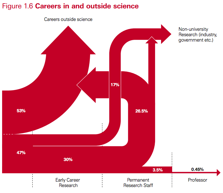
Yesterday, a friend posted this chart to Facebook, noting that the topic was “uk ph.d. graduate career paths” and that in their experience (as an academic in North America), the percentages looked pretty close. I share my friend’s concern about career options for PhDs, but looking at the diagram, the thing that stands out to me is how terrible it is — as a chart.

Screen shot 2013-11-10 at 11.57.09

Its source is a 2010 Royal Society policy report (PDF) entitled “The Scientific Century: securing our future prosperity”. In the original, Fig. 1.6 has a caption:

This diagram illustrates the transition points in typical academic scientific careers following a PhD and shows the flow of scientifically-trained people into other sectors. It is a simplified snapshot based on recent data from HEFCE[33], the Research Base Funders Forum[34] and from the Higher Education Statistics Agency’s (HESA) Annual Destinations of Leavers from Higher Education’ (DLHE) survey. It also draws on Vitae’s analysis of the DLHE survey[35]. It does not show career breaks or moves back into academic science from other sectors.

So what’s so bad about the chart? Some obvious issues:

  • It is unclear what goes in on the left and to a lesser degree what is covered by the end points. The report indicates in a footnote that the term “science” is used “as shorthand for disciplines in  the natural sciences, technology, engineering and mathematics,” but the three documents used for input categorise the fields in different ways, and there is no indication which fields exactly would have been selected.
  • Line thickness is not proportional to percentage weight. The 26.5% and 30% streams have the same thickness, and the 17% stream is much less  than half the thickness of either. The 3.5% stream is more than half the thickness of the 17% stream. 
  • Why does “Permanent Research Staff” not end in an arrow? And why does the arrow from “Permanent Research Staff” to “Careers Outside Science” bend backwards (to suggest it is a step back in one’s career, that is, an implicit value judgement?) and then not even merge with the output stream?
  • Does it really mean to suggest that no one goes from “Early Career Research” (that is, a post-doc) to “Career Outside Science” (or to industry research)? In my experience, watching post-docs, that is quite a common choice for post-docs precisely because non-academic jobs may be offering better pay and conditions, or because they don’t have a choice at that stage.

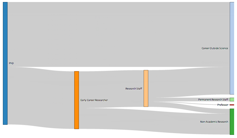
A graph like this is called a Sankey Diagram. They are very common to illustrate flows of energy, or of any quantity that is overall conserved (like here, the cohort of PhD. I wondered if I could make a better one (except for the flaws in content itself), even though I’ve never made one. I like to use R for data visualization tasks (or Python of course), so I quickly found out about a) Ramnath Vaidyanathan’s rather intriguing rCharts library, which provides interfaces from R to a variety of JavaScript plotting libraries and b) the implementation of the Sankey plugin for d3.js by someone called timelyportfolio. The integration is still a little rough for the newbie, but some crucial remarks at the end of  someone else’s tutorial got me started. (I’ve long been wanting to play with d3.js anyway, as it has impressive capabilities for geographic visualizations.)

Here’s my version:

Screen shot 2013-11-10 at 11.56.56

Well, the fonts are too small. Click for full-sized image.

One advantage of plotting directly to HTML5/JavaScript is that sharing charts is extremely easy. As produced by d3.js, the chart isn’t too impressive, with several links overlapping. But as it is interactive, I manually cleaned it up and took the above screenshot.[1]

The cleaner chart illustrates most of the issues with the original one. Clearly it is unrealistic that any post-doc who later ends up in a career outside science or in non-academic research goes through another academic research staff position first. (And some go from post-doc directly to professor.) A bigger problem is the absence of differentiation by discipline. What does it mean that maybe 25% of STEM PhDs go through a period as temporary academic researchers before ending up outside science? I completely agree that this part of a researcher’s career is currently highly problematic in most Western countries (keywords: low compensation, high job insecurity, high expectations of personal investment in research), but there is a huge difference between a graduate from many engineering disciplines, where highly qualified people are finding highly satisfying “outside science” jobs, and fields where not staying in academia or public research after a PhD is the equivalent of a career change (think of astrophysics or pure mathematics). Also, the longer I think about it and look at some of the source documents (Vitae report, PDF) the more questions come up. Does Medicine count? Is teaching part of “career outside science”? What about higher education lectureships?

So in the end I remain with the feeling that no graph would have been more useful than this graph. The only thing it illustrates is confusion and uncertainty in the career paths, and as such, wouldn’t using a work of art to make the point have been more honest than what I can only call the illusion of science?

[1] For anyone interested, the code is here. It was also an opportunity to try out graphs in R.

Global warming and me, part 2

[Go to part 1.]

I grew up in the 1980s, in Germany. Global warming caused by the burning of fossil fuels was getting attention in the press for the first time in a big way. The reporting was quite lurid — the announced “Klimakatastrophe” certainly was an attention-grabber — but the underlying scientific argument turned out to be simple enough for a teenager to grasp: The temperature of the earth surface is higher than it would be without the presence of certain components of the atmosphere, which cause the greenhouse effect (explanation skipped for the purposes of this post). The most important of these gasses is carbon dioxide. Burning carbon compounds that were buried underground a long time ago (many millions of years), humans add to the carbon dioxide that is naturally present, thereby increasing the greenhouse effect. By enough that the temperature on the earth surface should rise, on the average? Yes.

The next question that an interested mind would ask was “Can we see this temperature rise in measurements?” And back then, after some explanation regarding the difficulty to measure such a thing as a global average temperature, the answer was “Not yet: when we plot the curve, it trends upwards, but is still within the error bars. Come back in a few years.” (Error bars! Cool, I had just learnt about how to handle experimental error and uncertainty in maths and physics class!)

When in the early-mid 90s, I was working in a university lab, some of my friends worked in environmental physics, and their lab was right on the same floor. So I could ask them: what did they personally think? And the answer was unambiguous: Yeah, it’s going up. We expect it to go up theoretically, and it’s experimentally doing just that. They also warned that things would be a lot more messy than just a general warming at each location. We should prepare for more extreme weather — maybe some locations would get wetter or drier or even colder. It didn’t take long for these messages to move from my trusted scientific friends to official reports.

But global warming wasn’t the only or even the primary story about human activities harming the environment in pervasive and important ways that left an impression on my teenage mind. Not even close. Off the top of my head:

  • The ozone hole. Stratospheric ozone depletion over Antarctica was reported by a team of scientists from the British Antarctic Survey, in 1983.
  • Widespread damage to evergreen forests, most noticeably downwind from coal mining regions, dominated the environmental news in 1983 (and for a few years after that) under the keyword “Waldsterben” — the dying of the forests.
  • The Chernobyl nuclear incident happened on 26 April 1986. (I surprised my American/Canadian partner the other day by remembering the date.) It is hard to find a good single overview article on the web other than Wikipedia. For me and my peers this day marked the end of mushroom hunting and wild berry harvesting, and for weeks parents of my school friends checked out our school with Geiger counters.
  • The river Rhine, whose ecosystem was already known as severely damaged by industrial pollution, underwent multiple toxic spills, most prominently the release of large quantities of chemicals after a fire at the Sandoz agrochemical storage plant in November 1986.

I think it is the lessons I drew from how these and other events were handled and played out, then and over the years, that influence my attitudes now. A recent (and excellent) episode of the science podcast published by the journal Nature  looks back at the discovery of the ozone hole. One of the original authors of that first paper can be heard thus: “All of a sudden you look at it differently: Wow, we really can affect the planet as a whole.”

This statement on its own very much captures the main lesson, and it was new at the time. [The final part 3 is scheduled for May 21.]

Global warming and me, part 1

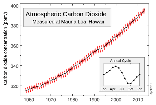
About a week ago, NOAA (the US National Oceanic and Atmospheric Administration) reported news from their longest-running atmospheric measurement station on top of Mauna Loa, Hawai’i: The average daily concentration of carbon dioxide in the atmosphere passed 400 parts per million (ppm) for the first time. This level was already reached a year ago in Barrow on the Alaskan north coast, and it is expected to take a few more years for global averages to rise to this number.

Mauna_Loa_Carbon_Dioxide_Apr2013.svg-1
Graph courtesy Wikipedia. Click to go to article.

The symbolic milestone led me to reflect on the messed-up state of the public debate on global warming and climate change, and its chances of moving into a saner state any time soon. I appreciate that people differ in their political attitudes and preferences about what actions should be taken, which I may agree or (strongly) disagree with. People may also pursue different goals, and that these may be in conflict between individuals. When it comes to discussing matters of fact, however, it should not be impossible to have a common ground on to lay them out and examine them, even if we end up drawing different conclusions or giving different weight to one over the other. Clearly, when it comes to the human impact on the earth’s climate and climate science in general this is very far from being the case.

When dealing with a scientific topic, only few people operate at the level of expertise to have a first-hand informed opinion on the current state of knowledge. Not that few, actually, but few compared to the size of the public as a whole. The rest of us rely on our general scientific background to evaluate what the specialist say, and on translators such as science writers, science educators and researchers from other disciplines to help fill gaps in understanding, link back to more basic knowledge and check that published results pass tests of plausibility. Another tool we use to figure out what factual statement we hold to be true is, I think, to be found in each individual’s biography: We build our mental model of how the world works incrementally. This is the case for judgements (what is important or not, what are the bases of my ethical guidelines etc.) just as much as for facts, and they intermingle. It is in this regard that I wonder about how the experience of the so-called denialists may contrast with mine.

Because it’s pretty much inconceivable to me how, having lived through similar times as myself, someone would end up believing that human activities are not causing changes to the global climate in a way that is worrisome. [Skip to part 2.]

Elsevier acquires Mendeley: some thoughts

The news has a way of trotting around my mind while I wait for the snow to melt. One recent item was that Elsevier, the academic publishing giant, has acquired Mendeley, a startup that runs one of the most popular academic citation management applications.

This news comes on the background of the persistent rumblings that have been going on in the  journal publishing space. There are many ways of approaching this debate, which revolves around the keyword “open access” and by now has matured to the point of touching on business models (who should pay? how much? what’s the role of institutional libraries and repositories?), pitfalls (what about academic vanity presses? how how to make peer review both effective and transparent ?) and a variety of interests (the taxpayer, who funds research that is locked behind paywalls; the corporations who are making large profits based on researchers’ volunteer work; the individual scientists who want to do the right thing without jeopardising their career).

Reference management is only a tiny aspect of the whole mess, but an interesting one. If we’re changing how scientific publications are disseminated the workflows and habits of researchers, who are both readers and authors, and the data we produce about them, become very relevant. Software can be a tool to empower the individual. I use Zotero, which makes my collection searchable, retrieves and manages metadata and PDF files from countless journal sites, and lets me export citations in any format I could wish for, saving me oodles of time and hassle.

Mendeley and Zotero are often mentioned in the same breath as they are similar in capabilities, and the basic offering is free of charge. Now some will disapprove of Mendeley’s decision to sell the company to Elsevier simply on the basis of Elsevier’s role as the principal bad guy in the story of large publishing corporations’ abusive practices towards academic scientific research. There’s a boycott going on after all. Others speculate about consolidation within Elsevier’s services.

But to understand why the unhappiness goes even deeper it is useful to step back and consider what’s at the bottom of it: the ways to make such software viable and the trade-offs they involve:

  • Charge for the software license itself. This is the strategy pursued by EndNote (which belongs to Thomson Reuters and has a list price US $ 250-300) as well as RefWorks (ProQuest, US $ 100/year) and the slightly cheaper Papers (a small startup acquired by Springer, $ 80). Such a strategy requires a sales and marketing team and substantial overhead that make your cost go up. The competition for software licensing fees from institutions is crowded, however, and the pot is limited.
  • Charge for storage of documents you save within the software. Zotero and Mendeley both do this. This is a straightforward, useful service offer, but I believe somewhat limited in how much revenue can be generated. Online storage is getting cheaper and cheaper, unlike staff to manage the offering. In the case of Zotero, a technically savvy user (or their institution) can get around storage limitations by setting up their own WebDAV service, as described in the product documentation. (This is what I do.)
  • Charge for premium features, such as collaboration tools, and thereby target institutions or teams. Mendeley does this. 
  • Get supported by institutions and non-profits. This is Zotero’s case: it is free and open-source software that started as a simple Firefox plug-in and is now a project of George Mason University’s Roy Rosenzweig Center for History and New Media, which receives funding from various big-name charitable foundations; it also incorporates volunteer contributions from the user community.
  • Or get supported by a large commercial company. What’s in for them? Access to the data you’re collecting: Any reference application that offers synchronisation of metadata is sitting on a large heap of information about what and how researchers — active scientists at the cusp of their careers — are using the scientific literature. If you’re an academic publisher this information is highly valuable.

So clearly Mendeley isn’t the first to be associated with a publishing house, and all of the major reference management tools pursue multiple approaches at once. But the last two of them are pretty much mutually exclusive: An open-source project can’t simply sell their users’ data to the highest bidder. If they tried, they might get forked and see their users run away. Zotero’s privacy policy is admirably clear, Conversely, if you start out with the intent to mine user-generated data you can hardly claim you’re serving the public good, and can’t very well open up your source code — your very competitive advantage. Not even Google, who do support free software projects, do that.

So this is where the rub is: Mendeley didn’t just sell themselves out; they sold their users out. Even if contrary to expectations the assurances that “nothing changes” turn out to be the truth, they still turned their users into cogs in Elsevier’s profit-generating machine (36% margin, last time I checked). Like Papers is, most likely, for Springer, or RefWorks for ProQuest, or even the expensive EndNote for Thomson Reuters. There’s a saying that if you aren’t the customer you are the product, but I think this is not quite correct: you can also be the means of production.

And this, too, is why I did pay attention to who is behind the reference management software I was choosing. It may be naive and sometimes premature, but I’m more inclined to trust a project that has a strong non-profit institution behind it. If it’s a big corporation, I want to know up-front and make a choice about sharing my data with them. If it’s a start-up, the question is how much can I trust in their integrity and ability to develop a sustainable plan without selling me out, as well as themselves?

Installing NCL on Ubuntu GNU/Linux 11.10

NCL stands for the NCAR Command Language, a free programming language that specializes in scientific data vizualisation. It is one of those rather idiosyncratic niche languages that few outside meteorology, climate science, oceanography or earth science have heard of but that can be a viable alternative to, say, Python with Nympy and Matplotlib, R, or for that matter the non-free but widespread Matlab.

It was during a pretty awesome NCL workshop that I started appreciating NCL more fully. Its main advantage, beyond the pretty powerful (and well documented) graphics capabilities, is that is provides a unified interface to some  unwieldy scientific and geospatial data formats. Coming from the world of commercial relational databases, it took me quite a while to understand how scientists think about data: a wide and deep topic for another post. For now, suffice it to say that scientific data often comes in large files that contain multiple series of data, plus metadata (data that describes either all or some of that data), and all need to be automatically processed. A typical task might be to read in such a file, retrieve several of the data series, select a sub-set of them (say, for some time span or some geographic area), calculate a new quantity, and plot the result on a map, with a proper map projection and latitude/longitudes. As I work daily with satellite data files (in formats that go by names such as HDF-EOS, NetCDF or HDF5), I appreciate a programming framework that swallows my downloaded GB and gives me this with a few lines of code and without costing an arm and a leg.

So for the scientist, trying out NCL might be a good idea, and on Mac OS X (10.6) this didn’t take more than a large binary download and a few clicks. Not so last weekend when I set up an Ubuntu system, unfortunately. So I apologize for this post becoming now very boring and describe how I got it to run and what decisions I made on the way.

0. The general approach

The following took place in a Virtualbox VM in order to create as reproducible a base as possible, that is a completely fresh install of Ubuntu 11.10 (Oneiric Ocelot) (the 32 bit desktop version).

What I’m describing is my third attempt, finally successful, at getting NCL up and running. Attempt 1 was to use the pre-compiled binaries, but the available 32-bit Debian Linux version just threw odd error messages that told me that at the very least some libraries and tools weren’t what it expected. This may have been fixable, but the task would have been frustrating and ultimately not very instructive.

Better to install from source, I thought, thinking I could use packages from the Ubuntu repositories for  most of the depenencies: libcairo, zlib or bison, or even widespread specialized stuff like GDAL (the Geopsatial Data Abstraction Layer software) are pretty standard, and the specialized file format libraries are available as well. However, this path also turned out to be fraught, mainly because the repository versions of the libraries related to these file types tended to not play nicely with each other, and also because the configuration file for the compilation of NCL itself expected certain libraires (hdf4, hdf5, netcdf, hdf-eos, hdf-eos5…) to be in certain locations relative to each other. I couldn’t get it right.

So at last here is what worked: Install only some of the dependencies, the unproblematic ones, from Ubuntu repositories, and install all of the finicky libraries and everything they  expect to be just-so through compilation from source. So here’s the recipe:

1. Install dependencies through the package manager

merian> sudo apt-get install build-essential gfortran csh ksh\
    flex bison openssl vim libcairo2-dev libjpeg62-dev libbz2-dev\
    libudunits2-dev libxaw7-dev libxt-dev libxft-dev libxpm-dev 
merian> sudo ln -s /usr/include/freetype2/freetype /usr/include/freetype

This takes care of: compilers, shells, tools; X11, graphics (including libpng and libjpeg), and some of the required compression libraries (bz2); and the Unidata Units package for unit transformations. It also corrects an odd discrepancy in where exactly the freetype library headers are expected by other source packages.

2. Download source code for the rest of the dependencies

There are a number of libraries NCL can optionally support or use. I decided not to install the whole kitchen sink, but to leave a few as an exercise to the reader, if needed: GRIB (a file format widely used for distributing meteorological data), Triangle (for triangular meshes used in climate modeling) and Vis5D+ (which I’ve never heard of). If you’re not interested in NASA satellite data, you can leave both of the HDF-EOS versions and HDF4 out as well. GDAL and PROJ4 are optional, too, but you really want nice mapping capabilities. This leaves the following tarballs.

3. Install dependencies from source

I’m following the NCAR instructions pretty closely and am installing in order: zlib first, then szip, libcurl and HDF5, which are needed by NetCDF. I was unable to persuade NetCDF to compile based on a mix of hand-compiled dependencies (in /usr/local/include) and Ubuntu header packets (in /usr/include), so all of the prerequisites had to be compiled, though some of their dependencies, in particular libjpeg and libpng, can be pre-installed. You may want to set the following environment variable, using setenv or export depending if you prefer a csh or bash type shell:

merian> export LD_LIBRARY_PATH=/usr/local/lib

Install zlib:

merian@ubuntu> ./configure --prefix=/usr/local
merian@ubuntu> make check; make install

Then, once zlib is installed, for example for libcurl, the configure command becomes:

merian@ubuntu> ./configure --prefix=/usr/local --with-zlib=/usr/local --with-pic

Pay attention to the libraries that you haven’t installed in /usr/local, and use –with-prefix=/usr in this case.

The biggest single task, and the only one where the NCAR/NCL site is incomplete, is putting NetCDF together. Very helpful are the installation instructions on the NetCDF site, both for the C libraries and the Fortran libraries. Do not worry about HDF4 support for NetCDF – we will give NCL HDF4 support through installing HDF4 directly.

Once you have NetCDF compiled and installed, the rest of the file formats come next: HDF4, HDF-EOS2 and HDF-EOS5. If you don’t need the last two, my suggestion is to simply not install support for them, but if you do follow the NCAR/NCL instructions to the letter. For HDF4, the most important point is not to forget –includedir=/usr/local/include/hdf as the software has its own version of the NetCDF header file (netcdf.h), which would overwrite the existing file. For HDF-EOS2, it is strongly advised not to use ./configure but to proceed as described and run bin/INSTALL-HDFEOS. The process involves manually editing makefiles and moving compiled libraries and header files to /usr/local/lib and /usr/local/include.

GDAL and PROJ4 are will typically be installed on any system that includes geospatial tools. The reason we install them from source is that GDAL comes with its own versions of HDF and other libraries, but needs to be linked against the same versions we built here. For the GDAL libraries, this configuration command worked well for me:

merian> ./configure --with-static-proj4=/usr/local --prefix=/usr/local \
    --without-pam --with-png=/usr --with-gif=internal \
    --with-libtiff=internal --with-geotiff=internal \
    --with-jpeg=/usr --with-libz=/usr/local \
    -with-sqlite3=no --with-expat=no --with-curl=no \
    --without-ld-shared --with-hdf4=no --with-hdf5=no\
    --with-pg=no --without-grib --with-freexl=no --with-geos=no

4. Install NCL

Downloading an NCL package requires a free registration at Earth System Grid/NCAR, which I’ve been told serves for NCAR to be able to count downloads and justify their funding. I do wonder if there isn’t a better way of achieving this.

Again, the instructions are nearly everywhere spot-on good. The process likes the environment variable NCARG to be set — I untar the source distribution, cd into the ncl_ncarg-[version] directory and run

merian> export NCARG=`pwd`

The SYSTEM_INCLUDE line returns “LINUX”, so that’s our makefile template. One change needs to be made in this file, regarding the Fortran compiler options:

#define FcOptions  -fPIC -fno-second-underscore -fno-range-check

Without the last option I got an arithmetic overflow error. It looked like it was only in a typecasting routine or other, but I guess I could have fixed that bug instead. In the configuration dialog, I used /usr/local/ncarg as the installation location, and I like then in the very end create symbolic links for the binary executables:

merian> ln -s /usr/local/ncarg/bin/* /usr/local/bin/

During the configuration dialogue, answer “yes” to all the optional dependencies you have compiled and “no” to those you don’t. And then compile. The make target “Everything” cleans out all previously compiled products, so takes longest if you have to fix a single error. “All” is faster, but what can happen is that the actual ncl executable may have got compiled but not moved to its final destination. So if your compilation output has no error but you can’t find the ncl executable, take a look in $NCARG/ni/src/ncl/. Otherwise it should be in /usr/local/ncarg/bin/ (or wherever your target location is.

Finally, test as described.

5. Final remarks

Frankly, I found this process painful. And I wonder why, much too often, we scientists put up with this — it’s not the first time that I’m seeing this. This is not a question of skills. I have the highest regard for the people at NCAR who maintain and develop NCL and provide free and high-quality support, thereby also spreading good coding practices and efficiency to newcomers. Maybe it’s the opposite: Because a typical computational scientists has the skills to deal with such an installation process, we don’t make the effort of fixing, say, the broken makefile of HDF-EOS2 once and for all, and don’t write install scripts that do away with the need to tell the software 592 times that we want it to be installed under /usr/local/ . Maybe there are license restrictions that would make it hard to repackage everything nicely, I don’t know. If so, we should make it clear that there’d be an advantage to getting rid of them.

Watching ice melt

In 2012 there were several news items about extreme large-scale melting events, the most memorable among which the Greenland ice sheet surface melt and the Arctic sea ice summer minimum. Observing ice melting on a smaller scale can be impressive, too, not to mention instructive. This thought was prompted by seeing multiple blog posts refering to the thawing-out of a large multi-level cold storage facility in Chicago, which was decommissioned and sold for future use as an office building. The process resembles the defrosting of a giant neglected freezer and at the same time melt pools are perfectly visible:

(Before the big thaw, a photographer had the opportunity to capture the ice formations and has published some pictures online.)

It may be shallow, but I love time lapse as a visualization tool. Back to nature, here is more. For example, we can look at only a small piece of Greenland such as a fjord and watch the spring melt of Kobbefjord, about 25 km from Nuuk.

In the north, the defining event of spring is called break-up: the moment when the ice goes out. Break-up transforms unpaved roads and tails into mud puddles for a week, but for rivers, it is over in a day. Some places run annual lotteries based on bets of the exact moment, down to the minute. Lately, the site yukonbreakup.com has done a great job posting images of the Yukon River at Dawson City, where the Klondike River enters. Particularly impressive this 2011 time lapse of the day the river went out. My heart does a skip right in the middle:

It is easy to understand how dangerous break-up is every year for the communities that border the great rivers. The destruction of Eagle Village in May 2009 by a moving ice jam and flooding of the Yukon River remains as a stark reminder.

What I do using the ten hundred most common English words

What better way to start a geoscience blog than to jump on a memetic bandwagon, right? Inspired by an XKCD cartoon — what else — a creative person called Theo Sanderson coded the Up-Goer Five text editor to incide people to write about a hard idea using only the most common 1000 (ten hundred, as “thousand” is forbidden) words of the English language. I’m not going to quibble about his selection at the lower edge of the 1000 number: it’s a charming idea and it became a geo-blogger meme. So here’s my attempt:

In the colder parts of the world a lot of the land is covered by trees. Every summer, some of the trees catch on fire. The fires can grow very large and burn a lot of the wood and other ground cover. Many of the fires happen far away from people because not many people live up here, but the smoke from the fires moves with the wind so in the towns and other places where people live they often can smell it. The smoke and little black bits from the fires are bad for people, especially children and sick people.

I work with a group that uses computers to find out where the smoke from the fires will move. We run the computers for hours and then make pictures of the land and put them where people can see them. There are the cities on the pictures and red and green and blue and so on, so people can see if there is going to be smoke where they live. To make the pictures we need to find out very fast when there is a new fire, and how big it is. For this I use other pictures — very large pictures that are taken from space. I get those pictures on my computer and have written something that makes the computer take a very close look at the pictures and tell me where the fires are and how big they are.

Another way to use the computer is to make it figure out where a fire is going. This is very hard for the computer, because it needs to know what grows on the ground, if there is water on the ground or rain falling, where the ground goes up and down, and so on. So I use a computer made from over one hundred smaller computers to make a picture of where the fire will be the next two or three days.

We also know that the cold parts of the world are getting warmer, and it is important to know if there are going to be more fires or maybe larger fires or the same place burns more often. This is a very interesting job to do.

More here.